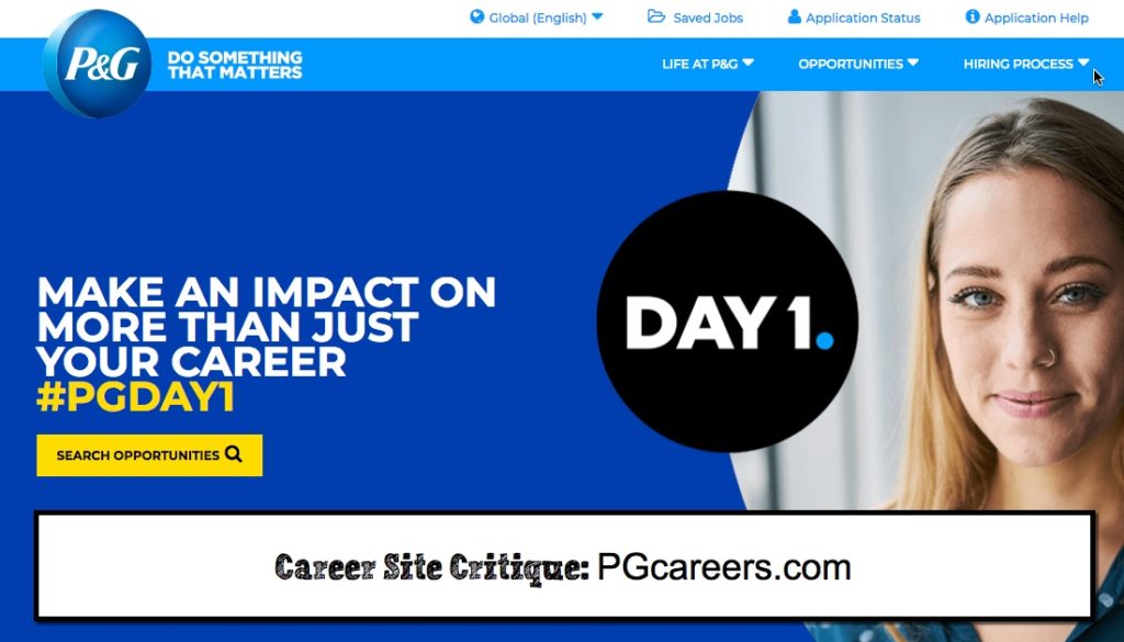
P&G unveiled a new responsive career site recently so I did a quick screencast of its pages. If I were grading I’d give it a “B-“.
A few of my dislikes were the tiny text, lack of video and text heavy job descriptions. Reading on the web is much different than print. I wish more companies cared about the readability of their pages and jobs.
Anyway here’s a 5 minute screencast tour of the site. Watch and learn.
